Neumorphism: Blending Skeuomorphism and Flat Design for a Fresh New Look
Imagine a digital interface that feels as if it’s gently emerging from its background—soft, subtle shadows and highlights that give your buttons and cards a tangible, almost touchable quality. Welcome to the world of neumorphism, a design trend that artfully marries the realistic depth of skeuomorphism with the clean simplicity of flat design.
In this post, we’ll explore what neumorphism is, how it blends the best parts of skeuomorphism and flat design, and what this means for modern UI/UX. Whether you’re a designer looking for fresh inspiration or simply curious about the latest trends, read on to discover how neumorphism is shaping the future of digital interfaces.
The Foundations: Skeuomorphism vs. Flat Design
Before we dive into neumorphism, let’s quickly review its two key influences:
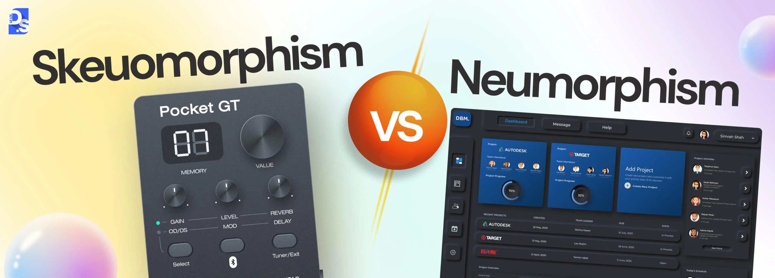
Skeuomorphism
- What It Is:
Skeuomorphism is a design style that mimics real-world textures and objects. Think of digital interfaces that look like leather-bound notebooks, buttons that resemble physical switches, or apps with realistic, 3D-like shadows. - Pros:
- Creates a sense of familiarity for users.
- Makes digital objects feel tangible.
- Cons:
- Can be overly detailed and cluttered.
- Sometimes outdated as users gravitate toward cleaner, more modern aesthetics.
Flat Design
- What It Is:
Flat design strips away extra elements like shadows and gradients to embrace simplicity. It uses solid colors, minimalistic icons, and clean lines to focus on usability. - Pros:
- Promotes a clean, modern look.
- Enhances usability with straightforward, clear layouts.
- Cons:
- Can sometimes feel cold or impersonal.
- Lacks the depth and tactility that can make interactions engaging.
Enter Neumorphism: The Best of Both Worlds
Neumorphism (a blend of “new” and “skeuomorphism”) takes the idea of soft shadows and light to create interfaces that have a modern, minimalistic look with a subtle depth. It’s all about creating a design that feels both fresh and familiar. Here’s how it works:
Key Characteristics of Neumorphism
- Soft, Diffused Shadows:
Neumorphic designs use delicate shadows to simulate depth, making elements appear as if they are extruded from the background. - Subtle Highlights:
Light plays a key role, with gentle highlights that add a three-dimensional feel without overwhelming the senses. - Minimalistic Color Schemes:
Often built on a monochromatic palette or soft hues, the simplicity enhances readability and user focus. - Smooth and Rounded Edges:
Rounded corners and smooth transitions contribute to a friendly, approachable interface.
How It Blends the Two Styles
- From Skeuomorphism:
It borrows the concept of realistic depth through shadows and highlights but tones it down to avoid the overly literal realism of traditional skeuomorphic designs. - From Flat Design:
It maintains the simplicity, minimalism, and clean lines that make flat design so appealing, ensuring the interface remains uncluttered and modern.
Benefits of Neumorphism
1. Aesthetic Appeal
Neumorphism creates a visually engaging experience that stands out from the traditional flat designs. The interplay of light and shadow offers a soft, tactile feel that invites interaction.
2. Modern Yet Familiar
By merging realistic elements with minimalistic design, neumorphism strikes a balance between innovation and familiarity. Users may feel more comfortable interacting with elements that appear subtly “physical.”
3. Focus on User Experience
The clean, understated design helps users focus on content and functionality rather than being distracted by overly ornate visuals.
Challenges and Considerations
While neumorphism is striking, it isn’t without its challenges:
1. Accessibility Issues
- Contrast:
The soft color palettes and subtle shadows might not provide enough contrast for users with visual impairments. Designers must ensure that text and important elements are easily distinguishable. - Interactivity Cues:
Without clear visual cues (like a distinct hover effect), users might have difficulty understanding which elements are interactive.
2. Overuse and Trend Fatigue
- Subtlety is Key:
Overusing the neumorphic style can make a website look monotonous. It works best when applied sparingly to highlight key elements, rather than dominating the entire design.
3. Technical Implementation
- Performance:
Creating these soft shadows and gradients might add complexity to the design code. Optimizing for performance is crucial, especially on mobile devices.
Best Practices for Using Neumorphism
1. Start with a Strong Foundation
Begin with a simple, flat design that is user-friendly and accessible. Then, add neumorphic elements gradually to enhance the design without compromising usability.
2. Ensure High Contrast
Keep accessibility in mind by using contrast checkers and testing your design with real users. Adjust the shadows and highlights to ensure that buttons and interactive elements are clearly visible.
3. Focus on Key Elements
Apply neumorphic effects to important UI elements such as buttons, cards, and input fields. Avoid overloading the entire interface with the style.
4. Iterate and Test
Always gather feedback through usability testing. See how users interact with your design, and be ready to make adjustments if the neumorphic elements hinder rather than help the experience.
Real-World Examples and Inspirations
Several modern apps and websites are already experimenting with neumorphism. Look for examples in design portfolios, UI inspiration galleries, or even on social media platforms like Dribbble and Behance. These examples can provide valuable insights into how to balance the style with functionality.
Imagine a weather app where the forecast cards subtly appear to lift off the background, or a music player with controls that gently seem to pop out from the screen. These small touches can create an engaging and modern experience without overwhelming the user.
Final Thoughts
Neumorphism is an exciting trend that brings a fresh twist to digital design by blending the best aspects of skeuomorphism and flat design. When implemented thoughtfully, it can add a unique, modern, and tactile feel to your interface, enhancing user engagement while maintaining simplicity.
As with any design trend, balance is key. Keep your focus on usability and accessibility, and use neumorphism to enhance—not overpower—your overall design. With careful planning and testing, you can create a visually stunning interface that stands out in today’s crowded digital landscape.