The Rise of Dark Mode:: Navigating the Design Landscape of Dark Interfaces
Introduction
In years, we’ve seen a growing trend in digital environments: the embrace of dark mode. Whether you’re scrolling through your favorite social media app or working late into the night on a project, dark interfaces have gained momentum like never before. But what is behind this shift? Why are so many users opting for a darker aesthetic? In this article, we’ll peel back the layers and explore the implications of dark mode design, its popularity, and the considerations designers must keep in mind when implementing it.
The Appeal of Dark Mode
Dark mode has captivated users for a variety of reasons, from aesthetic preferences to practical benefits.
Aesthetics and Personal Preference
- Visual Comfort: Many users find dark mode more visually appealing and softer on the eyes, especially in low-light conditions.
- Personal Preference: The choice between light and dark mode often boils down to individual taste. Just as some prefer bright colors in their surroundings, others are drawn to a more subdued palette.
“The beauty of dark mode lies in its elegance and simplicity – it’s almost like wearing a classic black dress.”
Health Benefits and Screen Time
Numerous studies suggest that dark mode can contribute to reduced eye strain, particularly during prolonged screen time. Users have reported experiencing less fatigue when using dark interfaces.
- Reduced Blue Light Exposure: Dark modes often emit less blue light, which can disrupt sleep cycles and lead to discomfort.
- Increased Readability: Some fonts and graphics pop against dark backgrounds, enhancing readability.
The Popularity Surge
An increase in dark mode adoption can be largely attributed to the influence of tech giants.
Major Platforms Embracing Dark Mode
- Apple: With the introduction of dark mode in iOS 13, millions of users switched to the darker aesthetic.
- Google: Programs like Android and popular apps like YouTube quickly followed suit, giving users the option to toggle their preferences.
- Social Media: Platforms like Twitter and Reddit have made dark mode available, aiming to cater to their visually focused user base.
The trend isn’t just confined to mobile platforms; desktop applications are also increasingly adopting dark themes.
Design Considerations for Dark Interfaces
While dark mode is appealing, designers must tread carefully to maximize its benefits and minimize challenges.
Accessibility and Usability
When designing a dark interface, accessibility should be a prime consideration.
- Color Contrast: Ensure there is sufficient contrast between background hues and text or graphical elements to make content legible.
- Color Harmony: Use a color palette that supports visibility while maintaining aesthetic appeal. Soft shades of white or pastel can often work better against dark backgrounds.
Content Structure and Navigation
- Intuitive Design: Users should be able to navigate easily within dark-mode interfaces, requiring thoughtful layouts.
- Consistent Branding: Dark mode should maintain brand identity. This includes using logos, icons, and color schemes that resonate with users, irrespective of the theme.
Feedback and Interaction
Ensure feedback mechanisms are visually intuitive. For example, highlighting buttons or providing animated responses can improve user engagement.
Dark Mode in Various Contexts
Dark mode is not a one-size-fits-all solution. Different contexts call for different considerations.
Mobile Applications
- Mobile devices often have limited screen space, so dark mode can help maximize visual clarity without overwhelming users.
- Consider empirical studies on mobile user behavior to gauge preferences.
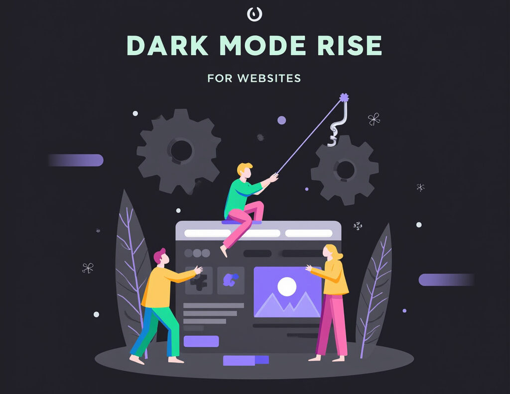
Websites and Web Applications
Web applications must balance aesthetics with load times. A dark mode might require optimized image and video assets to ensure they appear appealing against darker backgrounds.
Navigating the Future of Dark Mode Design
The future of dark mode design appears bright, but designers need to adapt continually.
Feedback Loops
Continually gather user feedback to refine the experience. Employ A/B testing to determine which design choices resonate best with users.
Evolving Trends
Stay updated with trends in UI/UX design. Technologies and user preferences evolve rapidly, and early adopters of change can set standard practices moving forward.
Conclusion
The growing popularity of dark mode reflects a deeper shift in how users engage with technology. From personal preference to health benefits, the reasons for adopting dark interfaces are clear. However, developers and designers must navigate the challenges posed by this trend strategically. As we look ahead, a thoughtful approach to dark mode design will not only cater to current preferences but will also shape the future of user interface design.
In closing, consider trying out dark mode not just for your personal use but also as a designer. How does it affect your interaction with interfaces? Explore and adapt as this dynamic landscape continues to evolve!
For further reading, check out resources like Smashing Magazine and Nielsen Norman Group for insights on UI/UX design trends.